A .PNG is worth a thousand characters. A classic saying with a modern twist. Pictures are certainly close to the heart of search engines that direct people to your website. Photos are eye-catching and a critical part of your website – both for user experience (UX) and search engine optimization (SEO). Maybe that seems obvious, but the nuances of website photography are worth emphasizing.
Think about when you clicked on this post. You saw the image, and without scrolling back up, you can still remember it fairly clearly. It made an impression; it established enough ethos for this post to get you to read this far, and it’s what you’ll most easily recall when you’re done here.
Consider these important aspects of how to select and integrate photography into your website in the most compelling, high-performing and search-friendly way:
Visual Branding
First and foremost, your website photography should support and further your company’s brand identity. As a web design agency, we strive to create continuity with the brand – in photographic subject matter, mood, composition, style and color palette. This might involve literal images that directly depict the organization’s offerings and capabilities, or it could take an abstract and artistic approach. Be intentional about what you’re doing with your website photography.
Whether you’re planning to use stock images or original photography, start by brainstorming themes and topics; then browse the Internet as well as stock photo sites for more ideas. Pay close attention to lighting, composition, contrast and colors, choosing only high-quality images and ones that take on the right tone to tell your story. Curate a collection of possible images, gathering more than you need. Then be selective as you eliminate photos that aren’t a fit.
Original vs. Stock Photography
There are trade-offs with both. Doing an original photoshoot to capture images of your products, people, environment, etc., is always the best way to achieve authenticity. After all, your images are yours and yours alone. However, photoshoots can be logistically challenging and/or cost-prohibitive. For this reason, many organizations opt for stock photography to save money and time. The challenge with stock is that images often look staged and “fake,” which reflects poorly on the brand. When using stock photos, go through the same careful curation process, choosing only images with a ring of truth and that fit together to support visual branding.
Website Photography Examples
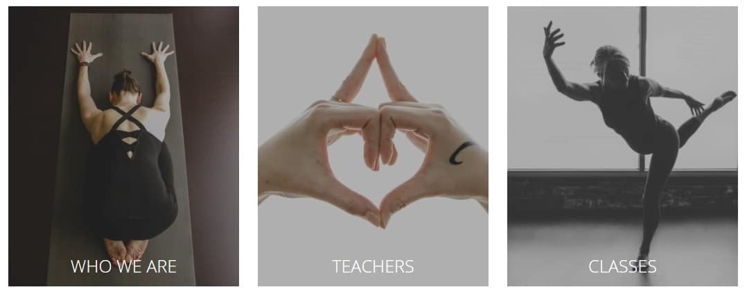
Our client, Blue Lotus Yoga, makes excellent use of original website photography to support its brand. We designed the site to be clean and minimalistic. Instead of heavy text, the site features beautiful images shot on location by Dana Hawley Photography. There were so many great shots we had a hard time choosing!
The simple navigation delivers all the information site visitors need without any fluff, and collectively, the images convey a warm, welcoming, zen-like tone reflective of the Blue Lotus brand. That’s just like the experience you have when you take a Blue Lotus yoga class or workshop – you get just what you need, physically, mentally and spiritually.

Image Resolution
Aesthetic, high-quality images are important; they establish the visual identity of your site. But a lovely painting is only lovely when it’s seen. So, on the more technical side of things, are your photos performing as they should to keep people on your site?
Take note: Bigger isn’t always better. A 300 dpi hero image may be beautiful, but it can take ages to load. A good web designer can maximize visual fidelity while minimizing file size. Don’t just consider the big hero images; think about how you’re handling website photography on all pages. If, for example, you upload unedited photos, they could easily be 2500 x 3000 pixels (massive). Some assume that if you scale down the image in your builder or select a “display thumbnail” option, the image won’t take as long to load. But the user’s browser still has to load that huge photo before it can scale it down. You could end up having your logo take up more resources than an image 10 times its size if you’re not mindful.
If you optimize your images and still have load time issues, consider a photo optimization plugin to shave off valuable load time.
Mobile Optimization
Many companies focus on how their website appears only on desktop monitors, yet there’s a good chance you’ve visited a website on your mobile device but clicked off because it didn’t load or the content kept shifting as it adjusted for mobile viewing. Users can become frustrated and leave your site. In fact, research from Google shows that around half of potential customers won’t purchase from a company or business with an unimpressive mobile website. Furthermore, Google algorithms are moving to mobile-first indexing.
So clearly, how your site appears on the phone is more important than ever before. Make sure your images are optimized for viewing on mobile, tablet and desktop devices to provide the best possible user experience and search opportunity.
ADA Compliance
Did you know that certain businesses are required to have their websites be accessible to people with disabilities, per the Americans with Disabilities Act (ADA)? Web content should be easy to access for users who are blind or deaf and for those who need to navigate by voice or screen readers. The rules around ADA web compliance are gray and still emerging, but it’s a good idea to start addressing accessibility now. You can see how your site stacks up with Google’s DevTool lighthouse.
With regard to imagery, you’ll need to pay close attention to the alt text, the tag on every image that is expected to contain a quality description of the image. Guidelines for alt text can be found here.
Trust the Experts
You never know who or how someone will find your site, but you’ll want it to look good and perform well when they do. Use these tips to optimize your website photography, and contact Group3 if we can help!


